
Reinventing a global used vehicle brand.
Brand Identity Design. UI/UX design. @ MetaDesign»Das WeltAuto« is a global used vehicle program of the Volkswagen group, including a variety of its car brands. At MetaDesign I was part of the team rethinking the brand identity.
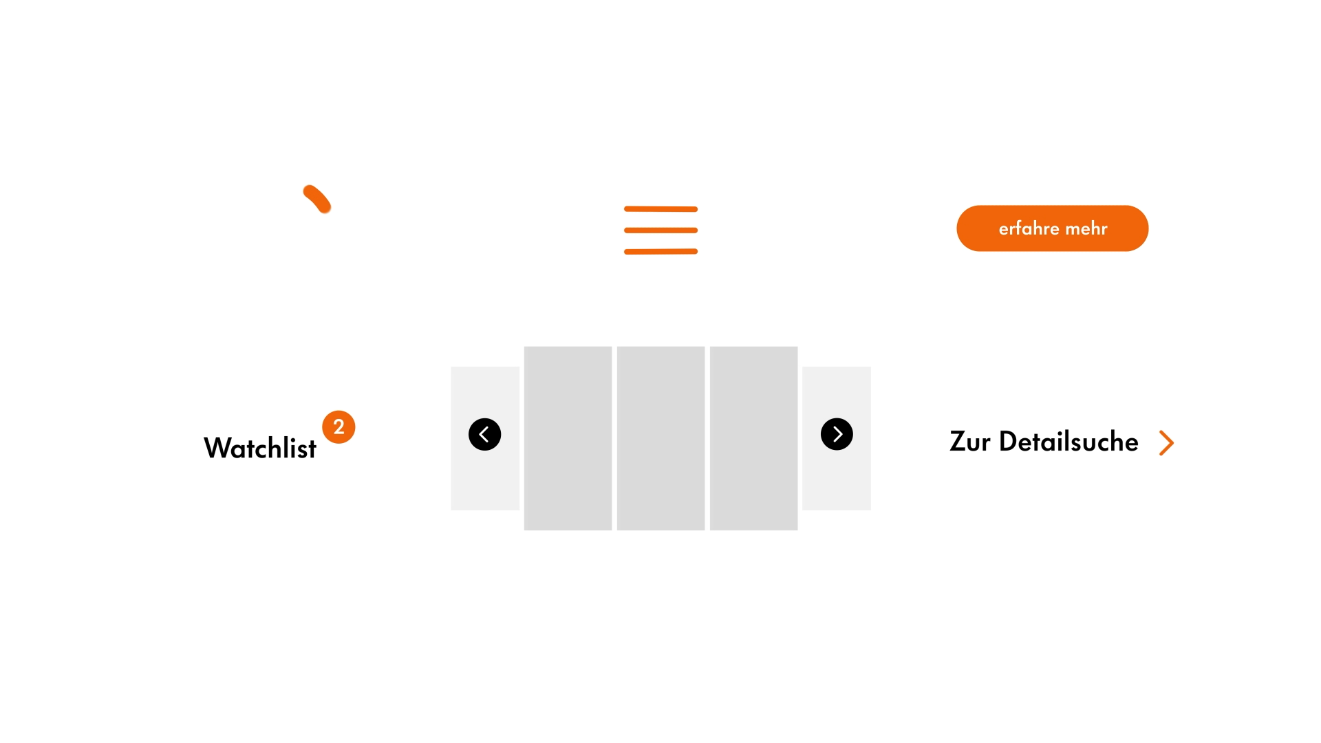
Given the need of an expressive but easy to use system, we designed a flexible graphic device, the “dot”, which allows for an adaptive expression when designing for different audiences, occasions and applications.


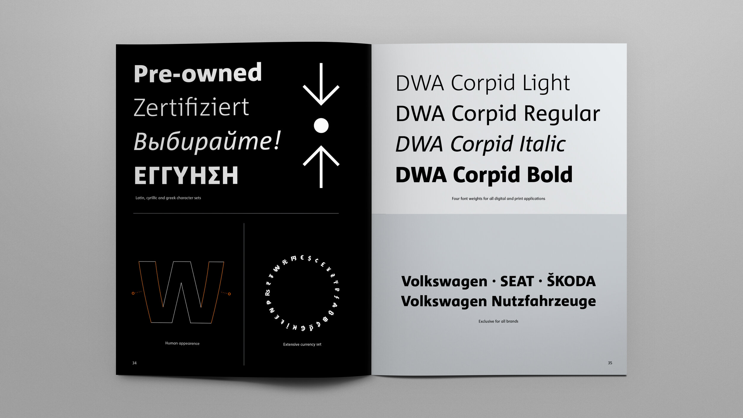
Typeface
Previously »Das WeltAuto« had used the old Volkswagen typeface. Considering that the program now includes not only Volkswagen vehicles but also several other car brands under its umbrella, we developed a highly functional and distinctive typeface suitable for a global market.
Iconography
A unique icon style will help communicate the program’s many benefits and provide a recognizable and consistent user experience.


Common elements allow for easy adaption.

A shared design language across different system icons.
Brand expression
The “dot” functions as a flexible graphic device. In combination with bold usage of typography and a collage-style imagery it allows for maximum expression while keeping a coherent appearance across touchpoints.

Brand book
One of the steps we took to communicate the brand refresh was to create a brand book showcasing the new brand identity to inform and inspire the company’s internal audience.


